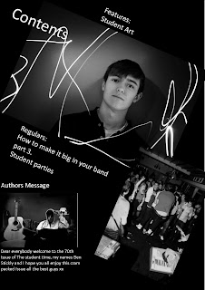
Thursday, 28 January 2010


This double page spread was taken from kerrang magazine and is part of the live section,the band featured are called Avenged Sevenfold a American band who were touring in the UK.

One side and half of the other page of double page spared is made up inertly of images from the live gig, there is one large image of the lead singer in the center of the pages, this image has been used to grab the attention of the readers and fans of the band because he is very recognizable and fans who are just flicking through would see a large image of him and possibly stop to read the article or if looking at the the magazine in a store they may be more likely to buy it. The other smaller images are all of the other band members, this stops all the focus being on the 'front man' of the band, this helps because in many bands fans often have there favorite member and this is not always the lead singer or the 'Front man'.

There is a very small part of the double page spread that has text on it, this is a very small but very detailed gig review, talking about about how Kerrang think the live gig went and also about what they think of the bands recorded work.
There is also a nice section at the bottom asking a member of the band how they think the gig went, i think this is a very nice touch and will consider using this in my magazine.

Wednesday, 27 January 2010


This contents page is the Christmas special for kerrang magazine, the page has been split in half with one large image on the top and all the other information on the bottom.

The large top image contains just one subject, i believe that the image could be described as having quite a humorous side as one of the members of Behemoth a 'death grime metal core' band is pulling quite a aggressive face illustrating his and the bands attitudes to music but at the same time he is holding a little silver star sat next to a Christmas tree, this is quite funny because when thinking of each thing separately people think of completely different things for example if you asked people what they thought about Christmas they would probably say things like; presents, joy, love, giving etc . But when you ask somebody what they think when you mention heavy metal ( you would have to use a much more basic term in the first place because not many people know about all the different subgeneras) the would often think about men with large beards jumping around sweating. Did kerrang do this to try and show how they can be a serious rock magazine whilst still enjoying Christmas maybe they did this to show to all those stereotyping people out there that a 'heavy metal rocker' looks forward to his visit of Santa just as much as the rest of us. I think the image is very clever because it could been seen as braking down barriers subliminally to all the readers, or it could just be a man sat next to a Christmas tree pulling a funny face. The image also obeys the rule of thirds, a subject framing technique were the photographer splits the image into three columns and places the subject in the left or right column and not in the middle, this is done because images are generally more pleasing to the eye when the subject is not directly in the center.

There are a couple of smaller inserts on the top image the contents title has got small icicles hanging from it this adding a little extra Christmas there are also small page inserts these have been used to show the main features in this weeks magazine, these small inserts are also used to cure the negative space left by the main image.

The bottom and top part of the page are split by a large banner saying KERRANG! THIS WEEK underneath this are columns of information containing all the regulars and new features in this weeks issue, there are a couple of headings with black backgrounds and yellow text, this is often used in most of the kerrang contents pages, repeating the same font and colors in the magazine helps to create a feel of consistency and regularity something that some readers may look for in a magazine.


Tuesday, 19 January 2010

KERRANG!


Kerrang! was first published on 6 June 1981, edited by Geoff Barton, initially as a one-off supplement in the sounds newspaper devoted to the current New Wave of British Heavy Metal and the rise of other hard rock acts such as AC/DC, who appeared on Kerrang!’s first cover. Original owner United Newspapers sold its music magazines to EMAP in 1991.
During the 1980s and early 1990s the magazine placed many
thrash and glam metal acts on the cover but later discarded them when grunge acts such as Nirvana rose to fame. Readers often criticise the magazine for repeating this process every time a new musical trend becomes popular; for example, Prince was heavily featured around the time of the release of Purple Rain, including a cover, and there are also issues in the 1980s featuring U2 and Big Country. More recently, there are many complaints about Kerrang!'s current emphasis on emo and metalcore music, particularly stemming from the fact that the magazine continually printed issues with My Chemical Romance on the front cover for several weeks, following the release of their album, The Black Parade.EMAP sold its consumer magazine to current owner Bauer Media Group in 2008.


The first thing that really stands out on the front cover to me is the large image taking up most of the front cover, this combined with the main coverline lets you know what the main image is about the band Biffy Clyro.
I think the one that is very clever, is the way that the title for the magazine has been edited around the photo, making the lead singer stand out more because he has been placed infront of the title wereas the other two members are placed behind the title giving the magazine image a feel of depth i think this is a very enginuitive and interesting technigue. With the lead singer wearing a white jumper and the other two members wearing black this make the lead singer stand out even more.

The front cover has a large focus on the band but also has some other headings on the bottom 1/3 of the cove, these show all the other features in the magazine it is good to show this as people who are not necessarily attracted to the main image could like one of the other smaller articles.


Week One
- Analyse front cover of Kerrang
- Analyse contents of Kerrang
- Analyse double page spread of Kerrang

Week Two
- Analyse front cover of Q
- Analyse contents of Q

Week Three
- Analyse front cover of MixMag
- Target audience questionnaire - sort results into a pie chart or graph.

Week Four
- Begin photoshoot

Week Five
- Finish photoshoot
- Edit the photos - remove blemishes / contrast / brightness / saturation

Week Six
- Mock designs of the front cover based on results gathered from research
- Mock designs of the contents page based on results gathered from research

Week Seven
- Mock designs of double page spread based on results gathered from research
- Begin final front cover design

Week Eight and Week Nine
- Complete all final designs: front cover / contents / double page spread

Week Ten
- Check final quality of all designs
- Evaluate final designs
- Evaluation

Tuesday, 8 December 2009


In what ways does your media product use, develop or challenge forms and conventions of real media products?
After analysing several student magazines, such as Ludlow College's "Student ID" magazine and "First Car". I used some features that they used for example I have tilted some of my photos to make them appear more exciting and attention-grabbing.
I think my front cover was quite different as I used the title from The Sunday Time and swapped the ‘unday’ from The Sunday Times and replaced that with ‘tudent’ and added that in graffiti like font making it seem the students have taken The Sunday Times for there own.

How does your media product represent particular social groups?

First of all I had to decide on my target age group I went for teens between the ages of 16 and 18 years old. I then tried to engage the age demographic with suitable topics, text and images. For instance, I used photos from college parties knowing students would be more likely to buy the magazine if there was a possibility to see themselves or close friends. I keep the colour scheme very basic using mostly whites and blacks to try and not attracted one sex more than the other.

Who would be the audience for your media product?
The audience for my student magazine will be second year college students to third year university students, aging between 17-20, and it will be a uni-sex magazine.
What kind of media institution might distribute your media product and why?
My magazine has quite a wide audience, who all need music, parties, art but more seriously advice about carries the future and relationships. I think no nonsense straight forward institution would like to distribute my magazine.

How did you attract/address your audience?

I would like to think my magazine was aimed at the more artistic and musical, the students who take an interest in these types of things outside of college/university when there not forced to. so the way in which I attracted the readers was by using interesting and clever magazine title, all the images I used where taken not just a random parties but student music gigs I thought they would seem more interesting for the readers.

What have you learnt about technologies from the process of constructing this product?
Because I study photography I already had quite a good knowledge about layout ect. If anything I feel the computer programmes we were using where holding me back.

Looking back at your preliminary task, what do you feel you have learnt in the progression from it to the full product?
I have learnt that research is a very important in designing and creating of a magazine.

Monday, 7 December 2009


This is a contents page from a skateboarding magazine i have added this to my blog to help illustrate the way you can lay out a contents page, the page has no main masthead on it just lots of smaller text about the publishers and writers on the left and side and the features on the right hand side, the only headings on this page are the two on the right explaining what is inside the magazine in my opinion that is all it needs. I really like this lay out with the images separating the two different bodies of information, something i would like to incorporate into my own contents page, but in my own page i would not use a series of images i would use completely different images to help illustrate what was in the magazine.


This is my third and final front cover design, the main image is one i have taken from a gig i had been to a couple of months ago and thought it would work quite well as all the hands seem like they are pointing towards the the grouped images in the side. The side bar is used to show what is inside the magazine i think it works really well as it shows a sneak preview to the rest of the magazine. The masthead of the magazine i think is the best part of the front cover, i have taken The Sunday Time's masthead and took away the letter 'unday' from Sunday and replaced them with 'tudent' so it reads The Student Times i think this works really well because it almost pokes fun and rebels at the serious papers which is quite a student thing to do.