Tuesday, 8 December 2009
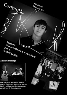
In what ways does your media product use, develop or challenge forms and conventions of real media products?
After analysing several student magazines, such as Ludlow College's "Student ID" magazine and "First Car". I used some features that they used for example I have tilted some of my photos to make them appear more exciting and attention-grabbing.
I think my front cover was quite different as I used the title from The Sunday Time and swapped the ‘unday’ from The Sunday Times and replaced that with ‘tudent’ and added that in graffiti like font making it seem the students have taken The Sunday Times for there own.
How does your media product represent particular social groups?
First of all I had to decide on my target age group I went for teens between the ages of 16 and 18 years old. I then tried to engage the age demographic with suitable topics, text and images. For instance, I used photos from college parties knowing students would be more likely to buy the magazine if there was a possibility to see themselves or close friends. I keep the colour scheme very basic using mostly whites and blacks to try and not attracted one sex more than the other.
Who would be the audience for your media product?
The audience for my student magazine will be second year college students to third year university students, aging between 17-20, and it will be a uni-sex magazine.
What kind of media institution might distribute your media product and why?
My magazine has quite a wide audience, who all need music, parties, art but more seriously advice about carries the future and relationships. I think no nonsense straight forward institution would like to distribute my magazine.
How did you attract/address your audience?
I would like to think my magazine was aimed at the more artistic and musical, the students who take an interest in these types of things outside of college/university when there not forced to. so the way in which I attracted the readers was by using interesting and clever magazine title, all the images I used where taken not just a random parties but student music gigs I thought they would seem more interesting for the readers.
What have you learnt about technologies from the process of constructing this product?
Because I study photography I already had quite a good knowledge about layout ect. If anything I feel the computer programmes we were using where holding me back.
Looking back at your preliminary task, what do you feel you have learnt in the progression from it to the full product?
I have learnt that research is a very important in designing and creating of a magazine.
Monday, 7 December 2009
This is a contents page from a skateboarding magazine i have added this to my blog to help illustrate the way you can lay out a contents page, the page has no main masthead on it just lots of smaller text about the publishers and writers on the left and side and the features on the right hand side, the only headings on this page are the two on the right explaining what is inside the magazine in my opinion that is all it needs. I really like this lay out with the images separating the two different bodies of information, something i would like to incorporate into my own contents page, but in my own page i would not use a series of images i would use completely different images to help illustrate what was in the magazine.
This is my third and final front cover design, the main image is one i have taken from a gig i had been to a couple of months ago and thought it would work quite well as all the hands seem like they are pointing towards the the grouped images in the side. The side bar is used to show what is inside the magazine i think it works really well as it shows a sneak preview to the rest of the magazine. The masthead of the magazine i think is the best part of the front cover, i have taken The Sunday Time's masthead and took away the letter 'unday' from Sunday and replaced them with 'tudent' so it reads The Student Times i think this works really well because it almost pokes fun and rebels at the serious papers which is quite a student thing to do.
This is my second magazine cover again, like the first i tried to tie it together with a simple color scheme, so i placed a the same text behind the other but changed the color to blue, also i used one main image on the cover with the cover lines getting larger and larger when getting closer to the bottom, i did this to try and make them look like they were coming out of the page. I think this cover and the previous cover are far to basic my next cover design will be a lot more interesting and busy.
Wednesday, 2 December 2009
First draft of front page
This is my first front cover design it is very basic, with one main image on the whole magazine cover with one red box, this is were the smaller images would go, along with some text.
The main title was made by over laying the same font over its self in different colors i think this is quite effective, i tried to tie the front cover together by giving it a color theme i think this helps all the different parts of the front cover become one.
Monday, 23 November 2009
-name
-age
-gender
-do you read any student magazines?
-what would be a good title for my magazine?
-what kind of articles would you read i.e music ,partys, interviews?
-do you think there is anything missing from current magazines that should be included?
-how much would you be willing to pay for a student magazine?
-what kind of photos would you like to see in a student magazie?
Tuesday, 17 November 2009
The title of the magazine is called 'First Car' under the main title of the magazine there is a small text saying 'The magazine for young drivers' basically telling you what the magazine is about in one short and easy sentence, this helps the buyer to know if the magazine is for them or not.
The main image is a photo of the four main characters from the hit TV show 'The Inbetweeners' the image is tilted and fills the whole front cover the main reason for this is the fact that they are very well know TV celebrities.
All the characters are making eye contact with the camera, they are all in full body shots apart from the one character who is closer to the camera, showing he may be a larger part in the show or the magazine interview.
The main image has a large banner across it 'The Inbetweeners interview inside' this is also on a tilted angle not as extreme as the photograph, this is in a large bold font with all the letters in block capitals, this shows that the interview will be the main focus of this issue of the magazine.I think this magazine is possible more of a one of magazine for first time drivers because the price of £2.95 and is a little bit too expensive for teenagers, unless they are really interested in this subject.The layout is quite ordered, with many captions and photos in line with each other. The colour scheme is simple with just yellow and white against the dark background. The other images are in smaller boxes at the bottom separated with a black border
Monday, 16 November 2009
Action Plan
wk.1
1.Set up my first blog
2.Make my first blog entry
3.Research on existing student magazines, upload photos and commment.
4.Decide on the target audience - perhaps a poll
5.Construct an audience questionnaire - what they want to see on a student magazine
wk.2
1.Mock designs - draw by hand, scan and upload. feedback from target audience.
2.Organize and do photoshop
3.Begin design on computer
wk.3
1.Continue designing
2.Complete first draft of pages, get feedback from audience
3.make appropriate changes based on feedback
wk.4
1. Finish pages and evaluate
2.Check quality of finished product
Subscribe to:
Posts (Atom)